7 Landing Page Hacks to Double Your Conversion Rate (No Developer Required)
Jun 03, 2025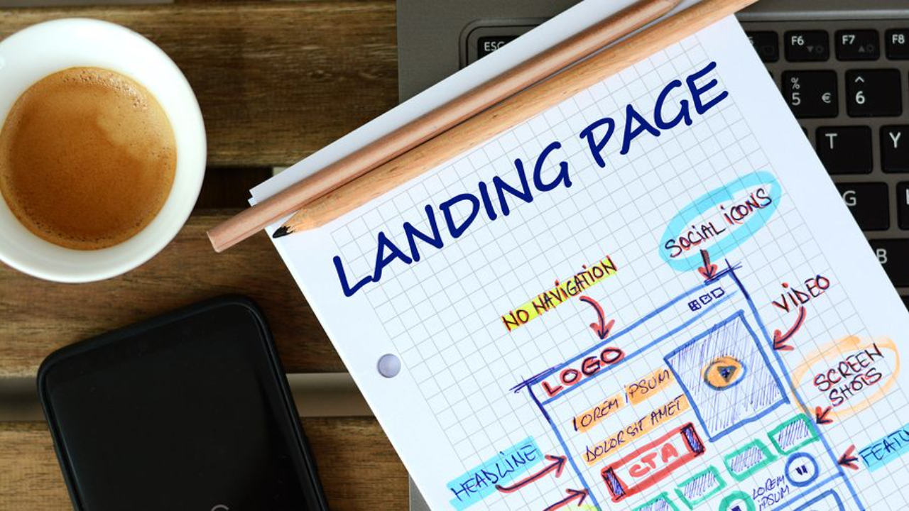
Last updated: April 2026 · Written by 20 Minute Marketing · 9 min read
Your landing page is probably losing you thousands of dollars in potential leads every single month. Not just a few—we're talking thousands.
Most business owners think their landing page is fine because traffic is coming in and a few people are signing up. But here's the reality: the average landing page only converts 2-4% of visitors. That means for every 100 people who visit your site, 96 just leave without taking action.
If you're paying for ads, even a small improvement makes a massive difference. Increasing your conversion rate by just 1% could mean thousands of extra leads or tens of thousands in additional revenue over a year—without spending an extra dollar on advertising.
Here are seven proven landing page hacks that consistently turn browsers into buyers. The best part? You can implement most of them today without a developer, redesign, or technical headaches.
Hack #1: Move Your Form Above the Fold
📘 Want the full picture? Read our practical small business marketing guide — the complete pillar guide this article is part of.
"Above the fold" means the part of your page your visitors see without scrolling. If people can't see your form instantly when they land on your page, most will leave without looking further.
This is one of the most common mistakes we see: beautiful landing pages with large header images and multiple paragraphs of text, with the form buried at the bottom. Then business owners wonder why nobody's filling it out!
Why it matters: When someone clicks your ad or link, they already know what they're coming for. They don't need a lengthy story—they want to take action immediately.
How to fix it:
- Open your page builder (WordPress, Wix, Squarespace, or whatever you use)
- Find your form and drag it to the top section, right under the navigation menu
- Check it on your phone—sometimes it looks fine on desktop but requires scrolling on mobile
- Ensure it's visible on both desktop and mobile without any scrolling
This is probably the easiest change you can make with the biggest impact on your conversion rate.
Hack #2: Tell People Exactly What They're Getting
Clarity beats cleverness every single time. Don't make people guess what happens when they fill out your form.
What most people do wrong: They use vague copy like "Get Started," "Learn More," or "Join Us." These phrases tell visitors nothing. What am I starting? What am I learning? Why should I join?
What to do instead:
- Use a clear headline that states the benefit: "Get Instant SEO Tips to Rank Higher on Google" or "Download the Free SEO Checklist"
- Add a one-line description explaining the format (PDF, video, cheat sheet)
- Keep your headline under seven words—shorter and clearer is better
- Remember that people scan online; they don't read every word
If they're getting a PDF checklist, say "Get Your Free SEO Checklist." If it's a video tutorial, say "Access the Free Training Video." Be direct and specific.
Hack #3: Make It Mobile-Friendly
Half of your traffic likely comes from mobile devices. Yet many landing pages look great on desktop but terrible on mobile—buttons are too small, forms are crowded, and visitors give up after tapping the wrong thing repeatedly.
How to fix it:
- Make your button big enough to tap easily with a thumb
- Add padding around form fields so people aren't trying to hit tiny boxes crammed together
- Test it yourself on your actual phone—don't just look at it, actually complete the form
- Experience the entire process to identify where users might struggle
You can use Chrome's developer tools to preview different phone sizes, but nothing beats testing on a real device. That's what your visitors are using.
If your form feels clunky or difficult to use on mobile, people won't complete it. Make it smooth, and you'll see your conversion rate increase.
Hack #4: Embed Your Forms Instead of Using Pop-Ups
Pop-ups are popular, but here's the problem: every extra click kills momentum. When someone lands on your page and has to close a pop-up or wait for something to load, some percentage will leave.
For a dedicated landing page where the entire point is getting someone to fill out a form, you don't need that extra friction. Put the form right there on the page—no pop-ups, no overlays, no waiting. They land, they see it, they fill it out. Done.
How to implement:
- Go to your email tool (Mailchimp, ConvertKit, or whatever you use)
- Grab the embed code for your form
- Add a custom HTML block in your page builder
- Paste the embed code
- Adjust styling to match your page design
Embedded forms convert better because there are no extra steps. Keep it simple.
Hack #5: Ask for Less Information and Enable Autofill
This is one of the easiest ways to boost conversions. Here's the rule: every extra field you add to your form drops your conversion rate.
If you're asking for first name, last name, email, phone number, company name, job title, and more, you're losing a significant number of potential leads.
What you really need: Most of the time, just an email address. Maybe a first name if you want to personalize emails—that's it.
Think about it: do you really need their phone number just to send them a PDF? Probably not. If you need additional information later, ask for it in a follow-up email once they already trust you.
Test this: Try a form with just email versus a form with first name and email. See which converts better. Often, the simpler form wins because it's faster to complete.
Enable autofill: When browsers can automatically fill in information, people are far more likely to complete the form because it takes virtually no time. This is especially important on mobile where typing is more cumbersome.
The easier you make it, the more people will complete the form.
Hack #6: Add Social Proof Right Below Your Form
This is one of the best ways to build trust, especially if people don't know your business yet. When visitors see that others have signed up and received value, they're much more likely to sign up themselves.
What works best:
- Short testimonials: "This doubled my traffic in 30 days. - Sarah M."
- Include a photo if you have one
- Keep it short and specific
- Include numbers: "Join 2,000+ small business owners who've downloaded this guide"
Placement is crucial: Put this directly underneath the form where people see it when they're deciding whether to fill it out. They look at the form, consider it, then see that 2,000 other people took action or someone got great results—that pushes them over the edge.
Social proof works because people look to others to decide what they should do. If everyone else is doing it, it must be worthwhile.
Hack #7: Upsell on Your Thank You Page
This is how you actually start making money from your landing page instead of just collecting emails. It works exceptionally well because people are already engaged.
Here's the flow:
- Someone fills out your form to get your free checklist (or whatever you're offering)
- They submit it and get redirected to a thank you page
- On that page, you offer them something low-ticket—maybe a $27 mini-course or a $37 template package directly related to what they just downloaded
Why this works: They just took action. They're interested, paying attention, and in a buying mindset. If you offer something valuable at a reasonable price, a percentage will buy it.
Even if only 5% of people take the upsell, that's revenue you weren't generating before. This is how you can recoup ad spend while building your email list.
How to set it up:
- In your email tool, find the setting for what happens after form submission
- Instead of showing a generic "thanks for subscribing" message, redirect to a custom page
- On that page, keep it simple: "Thanks for downloading the checklist. If you want the complete system with step-by-step videos, here's the full course for $27"
- Use a one-click checkout tool (Gumroad, SamCart) to make purchasing easy
- Optionally add a countdown timer for urgency: "This offer expires in 10 minutes"
Important: If you use a countdown timer, honor it. Don't be one of those businesses where the countdown resets every time someone visits the page. That erodes trust.
This transforms your landing page from a lead generation tool into an actual revenue generator.
Your Next Steps
Don't try to implement all seven hacks at once—that's overwhelming and you probably won't do it.
Pick one. Whichever hack stood out most or addresses your biggest current problem. Maybe it's moving your form above the fold. Maybe it's simplifying your form fields. Whatever it is, fix that one thing this week.
Then measure it. Check your conversion rate before and after. See if it made a difference. If it did, move on to the next hack.
That's how you actually improve: one change at a time, measure the results, and repeat.
Your landing page is either making you money or costing you money. With these seven hacks, you can shift the balance dramatically in your favor—without spending a dollar on additional traffic.
Need help optimizing your landing pages and digital marketing strategy? Visit 20 Minute Marketing for practical advice designed for Australian small businesses.
Get the complete digital marketing system built for Australian small business.
See the Essentials Course →Practical marketing, not theory.
20 Minute Marketing is the digital marketing course built for owners who need results, not lectures — short lessons, immediate actions, real outcomes.
Built for time-poor Australian small business owners.
You'll never need a Marketing Agency again!
Digital Marketing Courses that teach you more than an Agency ever could (or would!)