
Stop Losing Leads: The Psychology of the "Mobile-First" Call to Action
Feb 17, 2026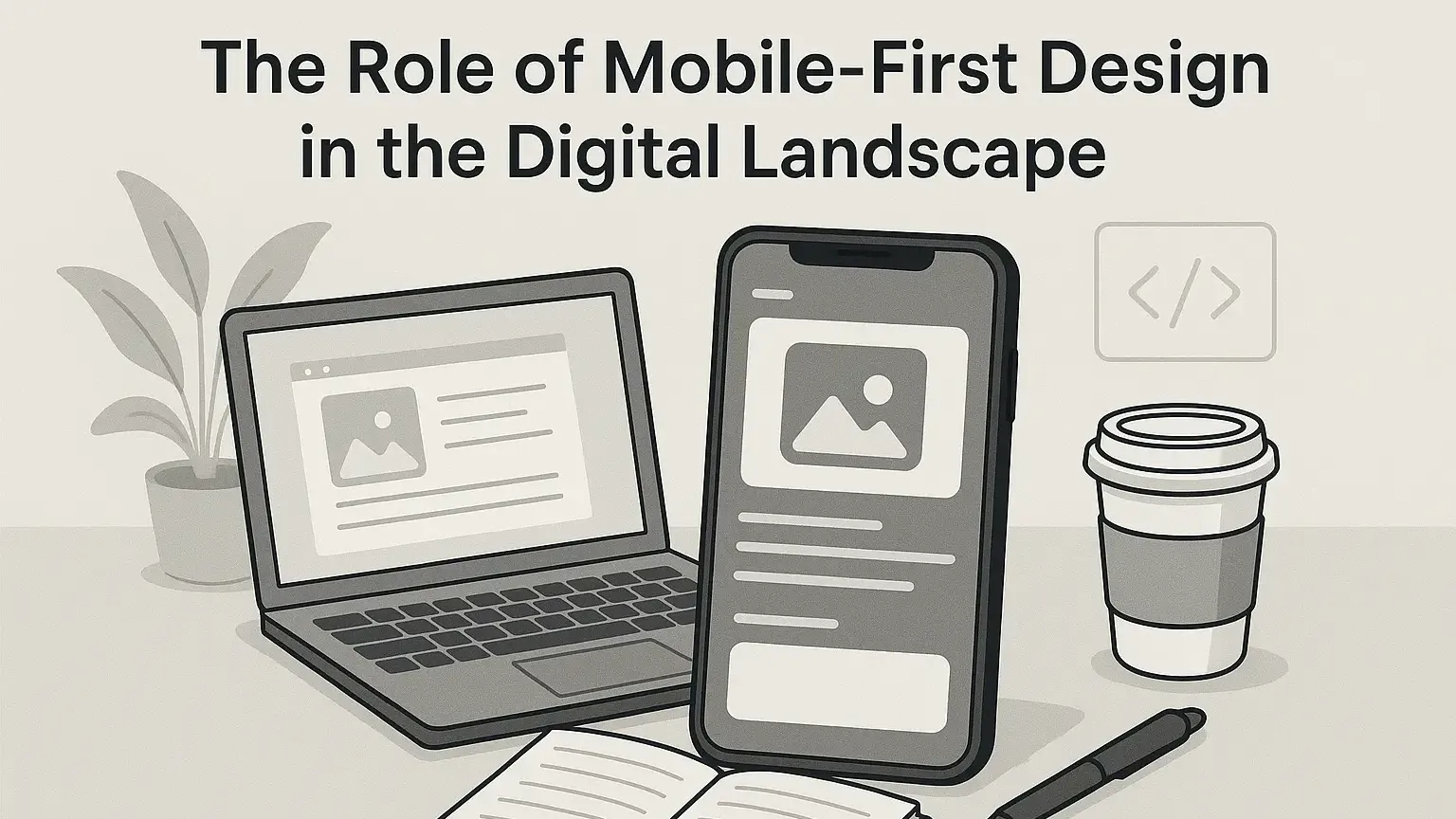
Last updated: April 2026 · Written by 20 Minute Marketing · 9 min read
The Desktop Delusion
Most small business owners design their websites on a laptop. They look at a big, beautiful screen and place a tiny "Contact Us" link in the top right corner. But in 2026, 82% of local searches happen on mobile. On a phone, that tiny link is impossible to hit with a thumb. If a customer has to "pinch and zoom" to click your button, they will leave. In the mobile era, your Call to Action (CTA) isn't just a button; it’s a physical interaction. This "Frictionless Conversion" strategy is a core pillar of our
Phase 1: The "Thumb Zone" Design (2 Minutes)
📘 Want the full picture? Read our real-world marketing tactics — the complete pillar guide this article is part of.
In 2026, UX (User Experience) designers follow the "Thumb Zone" map. Most people use their phones with one hand, meaning the corners of the screen are "dead zones."
Where to Place Your Buttons
-
The Center-Bottom: This is the high-conversion sweet spot. Place your primary button (e.g., "Get a Quote") where the thumb naturally rests.
-
The "Sticky" Footer: For service businesses, a "Call Now" button that stays fixed to the bottom of the screen as the user scrolls is the #1 way to increase inquiries.
-
Size Matters: Your button should be at least 44x44 pixels.
1 Anything smaller leads to "Fat Finger Syndrome" and frustrated users.
Phase 2: Micro-Copy Psychology (3 Minutes)
In 2026, boring words like "Submit" or "Contact" are conversion killers. They sound like work. Your CTA copy should focus on the Value, not the Task.
The "Benefit-Driven" Rewrite
| Old Boring CTA | New 2026 CTA | Why it Works |
| Submit Form | Get My Free Quote | Focuses on what they get. |
| Contact Us | Talk to an Expert | Positions you as an authority. |
| Download | Claim My Guide | Creates a sense of ownership. |
| Subscribe | Join 500+ Locals | Uses "Social Proof" to build trust. |
The AI Hack: Use your
Phase 3: Reducing "Click Anxiety"
On mobile, people are hesitant to click because they don't want to be trapped in a long form or a sales trap. You must use Micro-Copy (tiny text under the button) to lower their guard.
-
Under a "Book Now" button: "Takes only 30 seconds."
-
Under a "Call" button: "No obligation chat."
-
Under a "Download" button: "No credit card required."
As noted in our
Phase 4: The "One-Touch" Integration
Mobile users are lazy (and busy). Every extra tap is a chance for them to quit.
-
Click-to-Call: Ensure your phone number is a "tel:" link. When they tap it, their phone should immediately dial.
-
Google Maps Direct: Instead of just listing your address, use a button that says "Get Directions" which opens directly in their Maps app.
-
Apple/Google Pay: If you sell products or deposits, having "One-Touch" payment eliminates the need for them to find their wallet in a coffee shop.
Chapter 5: Testing Your "Mobile Speed"
In 2026, Google’s Core Web Vitals punish slow mobile sites.
-
The Test: Go to
Google PageSpeed Insights -
The Goal: Your "Time to Interactive" should be under 2.5 seconds.
-
The Fix: If it’s slow, revisit our guide on
optimizing images for small business
FAQ: Mobile CTA Strategy
"Should I use pop-ups on mobile?"
Generally, no. Google penalizes "Intrusive Interstitials" (pop-ups that cover the whole screen). If you must use one, ensure it only covers 20% of the screen and is very easy to close.
"What color should my button be?"
There is no "magic" color, but it must contrast. If your site is blue, use an orange or yellow button. Use the "Squint Test"—if you squint your eyes and can't find the button in 1 second, it needs more contrast.
"Can I have two buttons?"
Yes, but one must be the "Hero." Make the main action (Call) a solid color and the secondary action (Email) an "outline" or ghost button.
Conclusion: Design for the Thumb, Not the Eye
Your website might look beautiful on your 27-inch monitor, but your bank account lives on your customer's 6-inch phone. By making your CTAs thumb-friendly, benefit-driven, and lightning-fast, you stop being a "browsing" site and start being a "buying" site.
Want to Audit Your Mobile Conversion?
In our Digital Marketing Essentials Course, we include a "Mobile UX Checklist" that helps you find the "Leaky Buckets" in your mobile site in under 15 minutes.
Enroll in the 20-Minute Marketing Essentials Course – Boost Your Mobile Sales
Get the complete digital marketing system built for Australian small business.
Join the Essentials Course →Practical marketing, not theory.
20 Minute Marketing is the digital marketing course built for owners who need results, not lectures — short lessons, immediate actions, real outcomes.
Built for time-poor Australian small business owners.
You'll never need a Marketing Agency again!
Digital Marketing Courses that teach you more than an Agency ever could (or would!)