
Mobile Email Design for Small Business: How to Create Emails That Look Perfect on Every Screen
Mar 28, 2026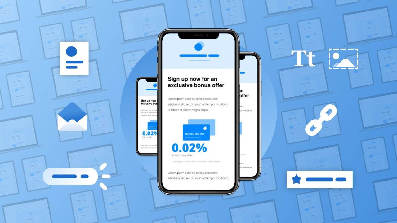
Last updated: April 2026 · Written by 20 Minute Marketing · 9 min read
More than half of all emails are now opened on a mobile device. If your emails look great on a desktop screen but fall apart on a phone, you are losing more than half your audience before they read a word.
For small businesses, this is not a design problem — it is a revenue problem. An email that renders poorly on mobile gets deleted in seconds. The subscriber does not squint, zoom, or switch to their laptop. They swipe and move on.
The Single-Column Rule
📘 Want the full picture? Read our how to automate your email — the complete pillar guide this article is part of.
Desktop emails often use multi-column layouts — a main area with a sidebar, or two products side by side. On mobile, these collapse unpredictably. Sidebars stack below the main content. Two-column grids shrink to unreadable sizes.
The fix: design every email as a single column. One column of content flowing top to bottom, readable on any screen width. This is the industry standard because it works universally across all devices, email clients, and screen sizes.
Font Sizes That Work on Mobile
| Element | Minimum size | Why |
|---|---|---|
| Body text | 16px | The size iOS and Android render without forcing the user to zoom |
| Headlines | 22–28px | Readable at a glance on small screens |
| Button text | 16–18px | Easy to read and comfortable to tap |
| Fine print / pre-header | 14px minimum | Never go smaller — zooming required below this |
| Line height | 1.5× font size | 16px body = 24px line height for comfortable reading |
Designing Tappable Calls to Action
On mobile, a finger is imprecise and needs a much larger target than a mouse cursor. A small text link buried in a paragraph frustrates mobile users — most will not bother trying to tap it accurately.
- Use buttons, not text links, for your primary CTA
- Minimum button height: 44px (Apple's recommended touch target)
- Width: at least 200px, or full-width spanning the email column
- Padding: 10–15px inside the button so text doesn't crowd the edges
- Place your primary CTA within the first screen — before scrolling is required
- One primary CTA per email. Multiple competing buttons reduce click-through rate
Image Best Practices for Mobile Email
| Challenge | The fix |
|---|---|
| Slow load time on cellular connections | Compress every image to under 200KB. Keep total email under 800KB. Use TinyPNG or your platform's built-in compression. |
| Image blocking by email clients | Use live text for all key messages. Images support content — they don't carry it. |
| Images wider than mobile screen | Max width 600px. Use percentage-based widths so images scale down responsively. |
| No alt text | Always add descriptive alt text so subscribers with images blocked still understand what the image conveys. |
Pre-Header Text: Your Secret Mobile Weapon
Pre-header text is the short preview appearing next to or below your subject line in a mobile inbox — often the deciding factor in whether someone opens or scrolls past.
Subject: "The one thing killing your Google ranking"
Pre-header: "And the 5-minute fix most small businesses miss."
Together, they create a one-two punch that drives opens. Keep pre-header between 40–130 characters. Set it deliberately in your email platform — don't let it default to random body text.
Dark Mode Compatibility
An increasing number of mobile users have dark mode enabled — which can invert your email's colours. A beautiful email with black text on white can become unreadable, and logos with transparent backgrounds may disappear entirely.
- Use solid background colours behind logos and key graphics — no transparent backgrounds
- Test in dark mode before sending — most email platforms now include a dark mode preview
- Use high-contrast colour combinations that work in both light and dark modes
Testing Before You Send
Never send a campaign without testing on a real mobile device. Send a test email to yourself and verify:
| 1 | All text is readable without zooming |
| 2 | Buttons are large enough to tap comfortably |
| 3 | Images load quickly and scale correctly |
| 4 | The email requires no horizontal scrolling |
| 5 | Links are spaced far enough apart to tap individually without hitting another link |
Learn email marketing built for Australian small business
The 20 Minute Marketing Essentials Course covers mobile-optimised email design, list building, automation sequences, and deliverability. $49/month
See the Essentials Course →Frequently Asked Questions
What percentage of emails are opened on mobile?
More than 50% of all emails are now opened on a mobile device, with some industries — retail, hospitality, consumer services — seeing mobile open rates above 60–65%. Designing for mobile is not optional; it is the default.
Do I need to know HTML to create mobile-friendly emails?
No. Every major email platform (Mailchimp, ActiveCampaign, Klaviyo, Campaign Monitor) offers responsive templates that adapt to screen sizes automatically. Choose a single-column template and apply the font size, button sizing, and image compression principles in this guide — none of which require coding.
Why does my email look different on Gmail vs Apple Mail?
Email clients render HTML differently. Gmail, Apple Mail, and Outlook each have their own rendering engines with different levels of CSS support. Use inline CSS, avoid complex layouts, and test across multiple clients before major sends.
What is Gmail clipping and how do I avoid it?
Gmail clips emails larger than 102KB of HTML, hiding the bottom behind a "View entire message" link most people never click. To avoid: remove unnecessary HTML, limit images, use web-safe fonts, and keep your email focused on one message rather than multiple topics.
Ready to put email on autopilot?
The 20 Minute Marketing course walks you through every sequence, automation and list-building tactic — built for owners with no time to spare.
Built for time-poor Australian small business owners.
You'll never need a Marketing Agency again!
Digital Marketing Courses that teach you more than an Agency ever could (or would!)